|
Dialog Box Reference: Every Tag and Attribute |
Dialog Box Reference
This is the full catalogue of the dialog-box language — every element and every attribute the parser understands. For a guided introduction with worked examples, start with Dialog Boxes: Forms, Fields, and Native File Pickers; come here when you need the exact name of an attribute or the complete list of what a control accepts.
Each section is collapsed; click a heading to open it, or Expand all.
Every Supported Tag
A dialog body understands a fixed subset of HTML — the tags below, and no others. Each is detailed in the section that follows; this is the complete inventory in one place.
Show me: every tag the parser understands
| Group | Tags | Purpose |
|---|---|---|
| Window | <sheerpower> | The dialog window itself — title, size, colour, file-dialog type. |
| Form | <form>, <title> | Wraps the fields; <title> sets the window title from within the body. |
| Fields | <input>, <select>, <option>, <textarea> | The controls that return a value. |
| Tables | <table>, <tr>, <td>, <th> | Rows and cells for column layout; <th sort> makes a column sortable. |
| Headings | <h1> – <h6> | Headings, largest to smallest. |
| Text blocks | <p>, <pre>, <blockquote>, <address>, <div>, <center> | Paragraphs and block-level text. |
| Lists | <ol>, <ul>, <li> | Ordered and unordered lists. |
| Inline text | <b>, <strong>, <i>, <em>, <u>, <code>, <kbd>, <samp>, <tt>, <font>, <basefont> | Bold, italic, underline, monospace, and colour / size runs (<strong>/<em> render bold; <code>/<kbd>/<samp>/<tt> render monospace). |
| Breaks & rules | <br>, <hr> | A line break and a horizontal rule. |
| Media & links | <a>, <img> | A link / action and an image. |
Any tag not in this list is ignored. Write <,
> and & for a literal
<, > or &.
Sheerpower Extensions to HTML
Several features are Sheerpower additions, not part of standard HTML forms. They are collected here; each is detailed in its own section below or on the teaching page.
Show me: the Sheerpower-only options
| Feature | Markup | What it adds |
|---|---|---|
| Sortable column | <th sort> | A clickable diamond on the header; clicking re-sequences the whole table by that column (ascending, then toggles to descending). |
| Auto-submit | <sheerpower autosubmit=n> | Submits the form by itself after n seconds. |
| Submit on change | <select onchange="submit"> | Submits as soon as the selection changes — no button needed. |
| Field callback | onclick / call on <input> and <a> | Runs a routine when the control is used, without leaving the dialog. |
| Native file dialogs | <sheerpower type=open | saveas | select>, filter | Uses the OS file-Open / file-Save / folder-pick dialog instead of a form. |
| Body from a URL | <sheerpower href="..."> / src | Loads the dialog's body from a URL instead of the inline text. |
| Window behaviour | persist, ontop, inactive, noresize, autoscale, attached | Flags on <sheerpower> that control the window itself. |
| Pre-fill & field flags | the default clause, %focus, %readonly, %order, %error | Fill a form from a prior answer and mark fields focused / read-only / re-ordered / in error. |
The Window: <sheerpower>
The outermost element is the window. Everything else lives inside it.
Show me: every <sheerpower> attribute
| Attribute | Value | What it does |
|---|---|---|
title | string | The window's title-bar text. |
width | pixels or % | Window width; a percentage is of the screen. |
height | pixels or % | Window height. |
color | colour | Background colour (name or #rrggbb). |
background | filespec | A background image for the window. |
type | form | open | saveas | select | A data-entry form (default), or a native file-Open / file-Save / folder-pick dialog. |
filter | string | File-type filter for the file dialogs, written description=pattern — e.g. filter="CSV files=*.csv"; separate several with ; and several patterns within one with ,. |
href / src | URL | Load the dialog's body from a URL instead of the inline text. |
autosubmit | seconds | Submit the form automatically after this many seconds. |
persist | (flag) | Keep the window's position and size between runs. |
ontop | (flag) | Keep the window above other windows. |
inactive | (flag) | Open without taking the keyboard focus. |
noresize | (flag) | Fixed size; the person cannot drag the edges. |
autoscale | (flag) | Scale the contents to the window size. |
attached | (flag) | Attach the dialog to the main Sheerpower window. |
A (flag) attribute is written by name alone —
<sheerpower noresize ontop>.
The Form and Its Fields
Show me: <form> and <input>
<form> ... </form> wraps the fields. An
<input> is one field; its type chooses the
kind:
type= | Control |
|---|---|
text (default) | A single-line text field. |
password | A text field that shows dots. |
checkbox | A box that returns 1 or 0. |
radio | One button of a group that shares a name; returns the chosen value. |
hidden | Not shown; returns its value unchanged. |
submit | The button that closes the form and returns the answer. |
reset | A button that clears the form back to its defaults. |
image | A clickable image used as a submit button. |
Attributes an <input> accepts:
| Attribute | Value | What it does |
|---|---|---|
name | string | The key the field reports under. |
type | string | The control kind (table above). |
value | string | Starting text, or the value a radio / submit sends. |
checked | (flag) | Start a checkbox or radio selected. |
size | number | Visible width of the field, in characters. |
maxlength | number | Most characters the person may type. |
width | number | Width of the control. |
align | string | Alignment of an image input. |
src | filespec | Image file for an image input. |
valid | string | A validation rule the answer must pass (same words as line input's valid). |
message | string | A hint shown while the field is active. |
onchange | submit | Submit the form when this field changes. |
onclick | submit | Submit the form when this control is clicked. |
call | routine name | Call a routine when the control is used. |
Dropdowns and Lists: <select> and <option>
Show me: <select> / <option> attributes
| Element | Attribute | What it does |
|---|---|---|
select | name | The key the choice reports under (required). |
select | size | Rows shown; greater than 1 draws a list box rather than a dropdown. |
select | multiple | Allow more than one selection; the chosen values come back joined by chr$(10). |
select | message | A hint shown while the control is active. |
option | value | The value this choice sends (defaults to the option's shown text). |
option | selected | Start this option chosen. |
option | disabled | Show the option but do not let it be chosen. |
Multi-line Text: <textarea>
Show me: <textarea> attributes
| Attribute | Value | What it does |
|---|---|---|
name | string | The key the text reports under (required). |
rows | number | Visible height in lines (required). |
cols | number | Visible width in characters (required). |
wrap | string | Wrapping mode; physical returns the visible lines joined by chr$(10). |
maxlength | number | Most characters allowed. |
message | string | A hint shown while the control is active. |
Laying Out with Tables
Tables line fields up in columns. The elements are
<table>, rows <tr>, data cells
<td>, and heading cells <th>.
Show me: table, row, and cell attributes
<table>
| Attribute | What it does |
|---|---|
align | Horizontal placement of the table. |
width / height | Table size (width takes pixels or %). |
border | Border thickness. |
cellpadding | Space inside each cell. |
cellspacing | Space between cells. |
bgcolor | Background colour. |
bordercolor / bordercolorlight / bordercolordark | Border colour and its light / dark edges. |
valign | Vertical alignment of cell contents. |
<tr> (row): align, valign,
bgcolor, and the three bordercolor variants.
<td> / <th> (cells):
align, valign, width (pixels or %),
height, nowrap, bgcolor, and the three
bordercolor variants. A <th> also accepts
sort — a sortable column, described next.
Sortable Columns
Mark a header cell <th sort> and its column becomes
sortable. A small clickable diamond appears beside that header; clicking it
re-sequences the entire table by that column. The first click sorts
ascending, clicking the same header again reverses to descending, and clicking
a different sortable header sorts by that column instead. Any number of
columns in one table can each carry sort.
Show me: a sortable table
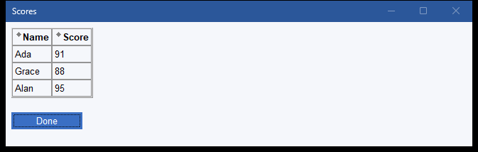
Both headers are clickable. Click Name and the rows re-order alphabetically; click Score and they re-order by number; click the same header again to flip the direction. Sorting is a display convenience for the person reading the table — it does not change what the form returns.
Text and Formatting
The body of a dialog is laid out with a familiar subset of HTML.
Show me: the formatting elements
| Element | What it does |
|---|---|
<h1> ... <h6> | Headings, largest to smallest. |
<p> | A paragraph (align attribute). |
<br> | A line break. |
<hr> | A horizontal rule (size, width). |
<b>, <strong>, <em> | Bold text. |
<i> | Italic text. |
<u> | Underlined text. |
<code>, <kbd>, <samp>, <tt> | Inline monospace (fixed-width) text, kept together on one line (no wrap); <tt> is the older spelling. |
<center> | Centre the enclosed content. |
<div> | A block (color, align). |
<font>, <basefont> | Text colour and size (color, size). |
<pre> | Fixed-width, as-typed text. |
<blockquote>, <address> | Indented / address blocks. |
<ol>, <ul>, <li> | Ordered and unordered lists. |
<a href="..."> | A link or action. |
<img src="..."> | An image (align, alt, height, width, border). |
<title> | Sets the window title from within the body. |
Entities and Comments
Show me: the character entities and comment form
Because < and > mark tags, write the
characters themselves as entities:
| Entity | Character |
|---|---|
< | < |
> | > |
& | & |
" | " |
| a non-breaking space |
A comment is written <!-- like this --> and is ignored.
The Answer Format
Show me: exactly how the answer is built
- Every control that returns a value contributes one
name=valuepair. - A clicked submit button contributes its own pair too — a plain
<input type=submit>reportsSUBMIT=submit. - Each pair is ended by a single separator byte,
chr$(26)— the last pair included, so a non-empty answer always finishes with the separator (this letsbetween$read even the final field). - A checkbox returns
1or0; a radio group and a single<select>return the chosenvalue. - A
multipleselect and awrap=physicaltextarea return their several values joined bychr$(10), inside the onename=valuepair. - The file dialogs (
type=open/saveas/select) return the chosen path as the whole answer. - A cancelled or closed dialog returns an empty answer.
The default clause pre-fills a form using this SAME format, so a
form's answer can be fed straight back to edit it (see the teaching page).
Read a field by name with between$(answer$, 'name=', chr$(26)); to
walk an unknown set of fields, split on chr$(26) and then on the
first =, skipping the empty final piece. Both are shown on
Dialog Boxes: Forms, Fields, and Native File Pickers.
Errors
Show me: the dialog-box error
A malformed definition raises a catchable exception,
Invalid input dialogbox format (extype -4031).
Guard a dialog built from data you do not control with
when exception (see Exception Handling) and read
extext$ for the message.
Reference at a Glance
- Window:
<sheerpower>— title, size, colour,typefor file dialogs, plus flags likenoresizeandontop. - Fields:
<input>(text, password, checkbox, radio, hidden, submit, reset, image),<select>/<option>,<textarea>. - Layout:
<table>/<tr>/<td>/<th>, plus the HTML text and formatting elements and the< > & " entities. - Answer:
name=valuepairs joined bychr$(26); errors raise-4031. - For the guided version with runnable examples, see Dialog Boxes: Forms, Fields, and Native File Pickers.